The Power of colour - GREEN
Welcome back to our series, The Power of Colour. This year we’ve been exploring and share the powerful impact that colour can have on our emotions, behaviour and overall well-being. In the last post we explored the psychological impact of yellow. This month, we discover how green has cultural significance and differing psychological effects to yellow and orange as well as some practical applications in modern branding.
Need help with design work in 2023?

GREEN
In the world of branding, colour plays a crucial role in creating a brand identity that resonates with your target audience. The right colour can communicate your brand's values, personality, and essence, and make a lasting impression on your customers.
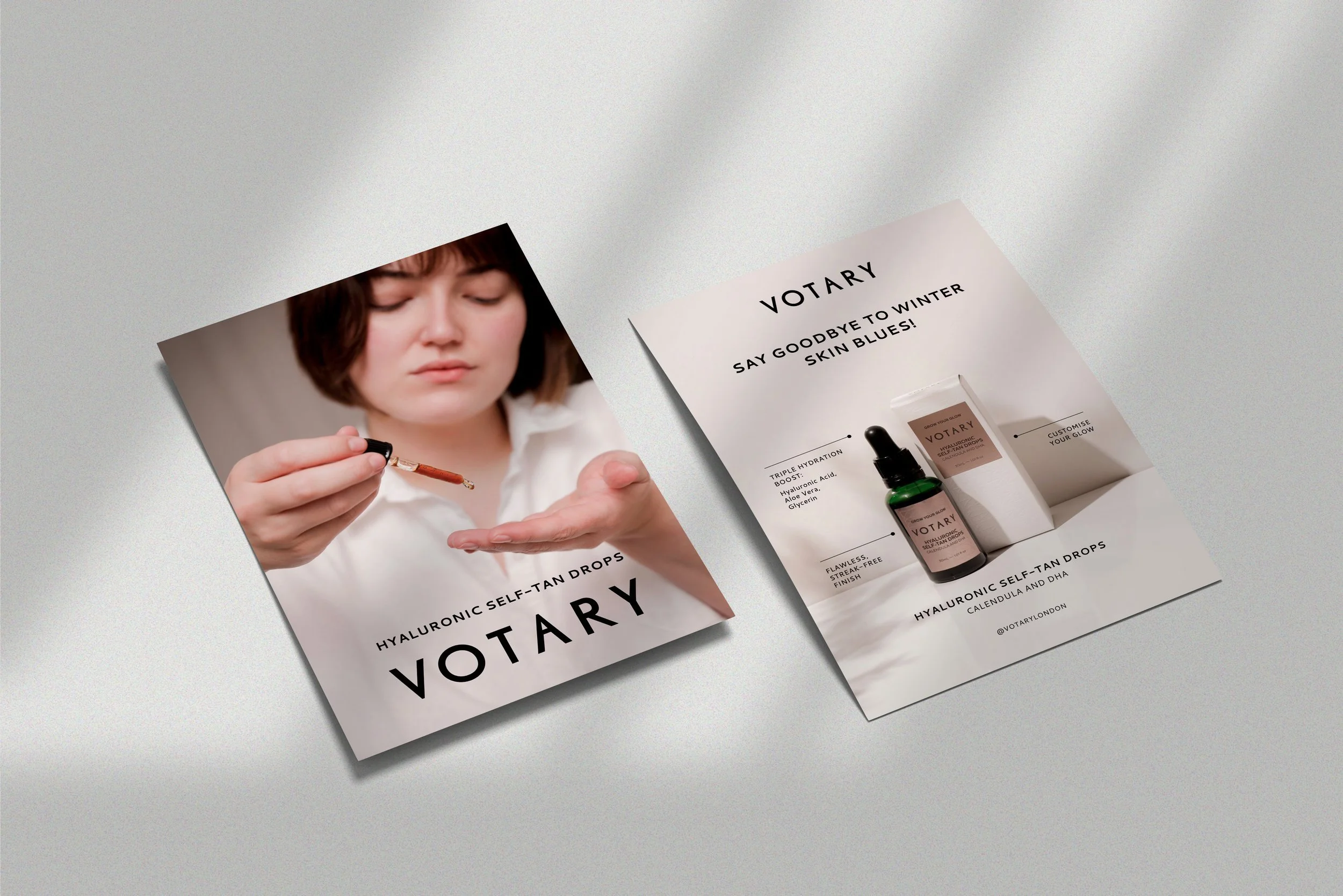
As freelance graphic designers, we’ve seen first-hand how colour can impact brand identity. Green is a popular choice among service-based businesses because of its association with nature, growth, and health. It's a versatile colour that can convey a wide range of emotions, from calmness and tranquility to excitement and energy.
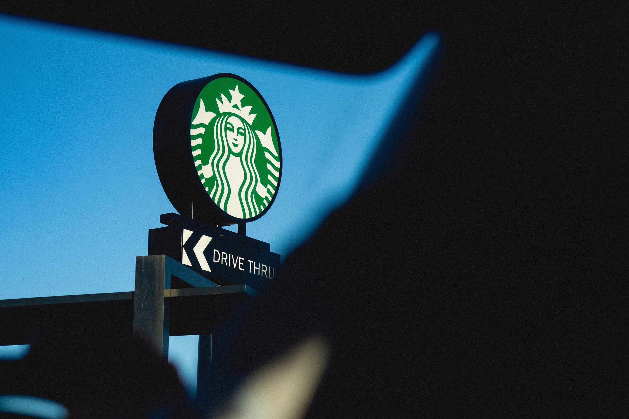
One of the most recognisable brands that use green in their identity is Starbucks. Their logo features a siren in a green circle, which represents their commitment to ethical and sustainable sourcing practices. The green colour also reflects their focus on providing high-quality, fresh ingredients in their coffee and food products.


Another brand that uses green effectively is Shopify, the leading e-commerce platform. Their brand identity is a combination of green and white, which creates a clean and modern look. The green colour represents growth and success, which is essential for a company that helps entrepreneurs build their businesses online.
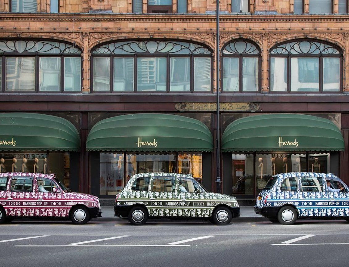
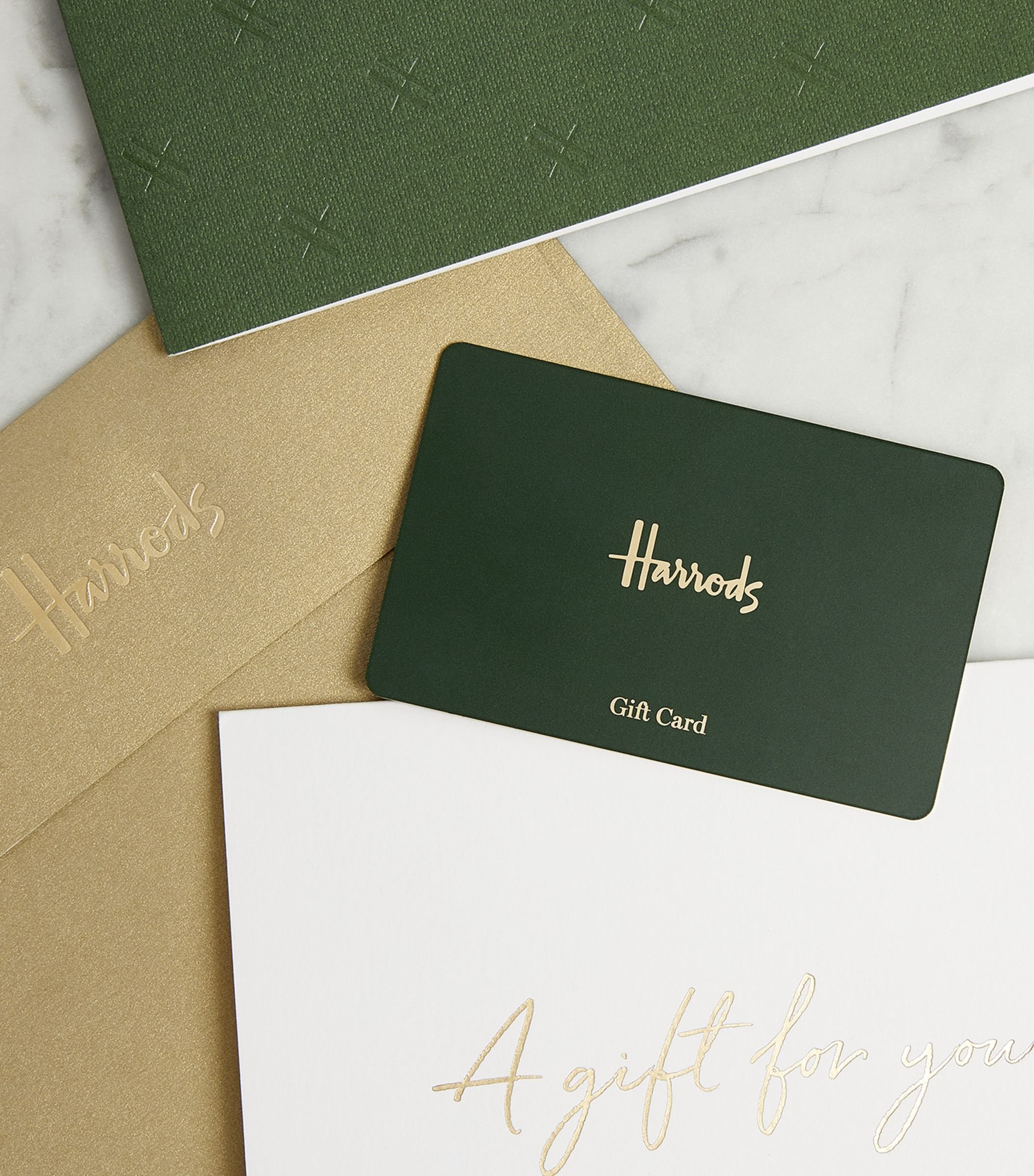
In contrast, Harrods, the luxury department store, also uses green in their branding. Their signature colour is a deep forest green, which represents the exclusivity and sophistication of their products. It also creates a sense of trust and reliability, which is important for a high-end brand like Harrods.


Spotify is another service-based brand that uses green in their identity. This time green represents their focus on music, which is often associated with nature and relaxation. It also reflects their commitment to sustainability and reducing their environmental impact.
So, why is green effective for service-based businesses? Green is a calming and reassuring colour that creates a sense of trust and security. It's also associated with growth and health, which is essential for businesses that want to convey a sense of vitality and progress. For service-based businesses, green can convey a sense of professionalism and exclusivity which is important for building trust with customers.
Green is an excellent choice for service-based businesses that want to convey a sense of growth, health, and professionalism. Brands like Starbucks, Shopify, Harrods, and Spotify have successfully incorporated green into their branding, creating a strong and memorable identity that resonates with their customers. As a design agency, we understand the importance of creating a strong brand identity, and we can help you choose the right colour palette for your business. Contact us today to learn more about how we create modern branding for clients just like you.