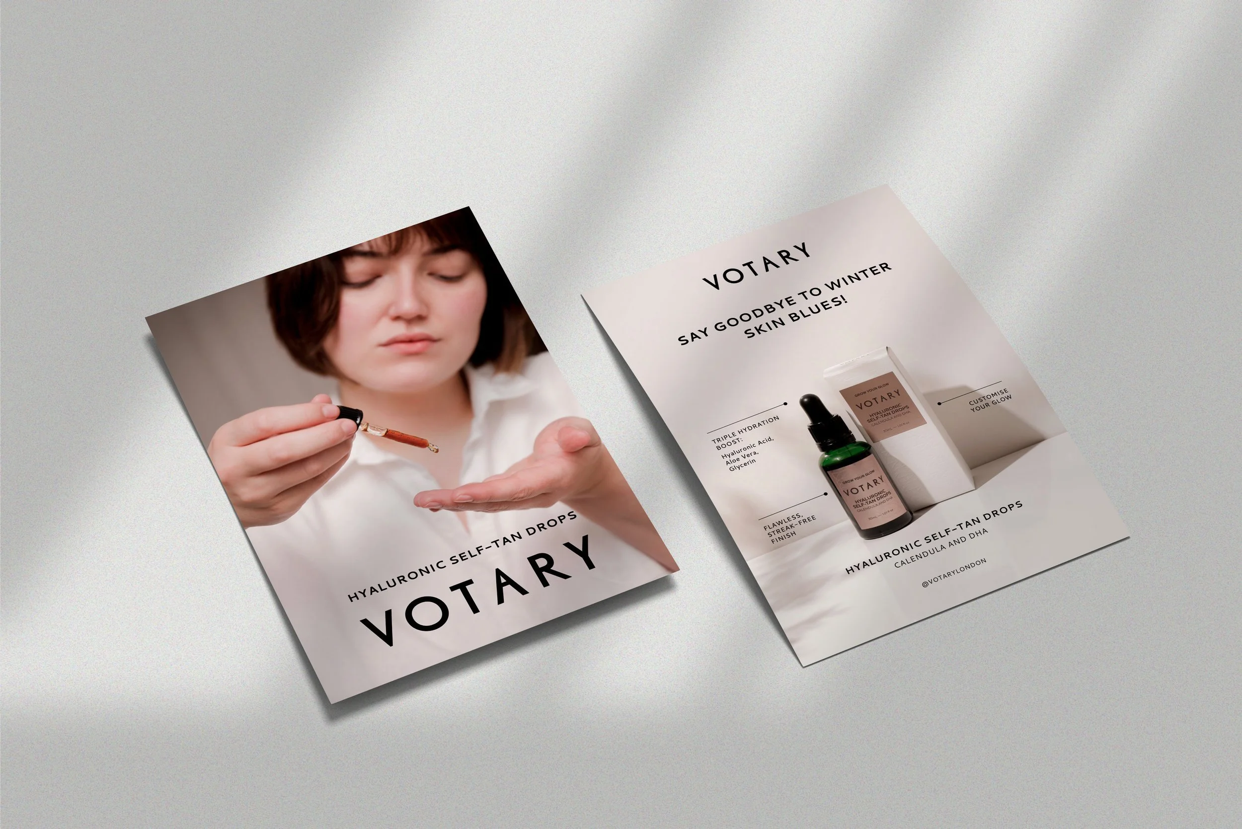
The Power of colour - RED
Welcome back to our series, The Power of Colour. This year we’ve been exploring and share the powerful impact that colour can have on our emotions, behaviour and overall well-being. In the last post we explored the psychological impact of blue. This month, we discover the power of red in modern branding for service and product based businesses.
Need help with design work in 2023?
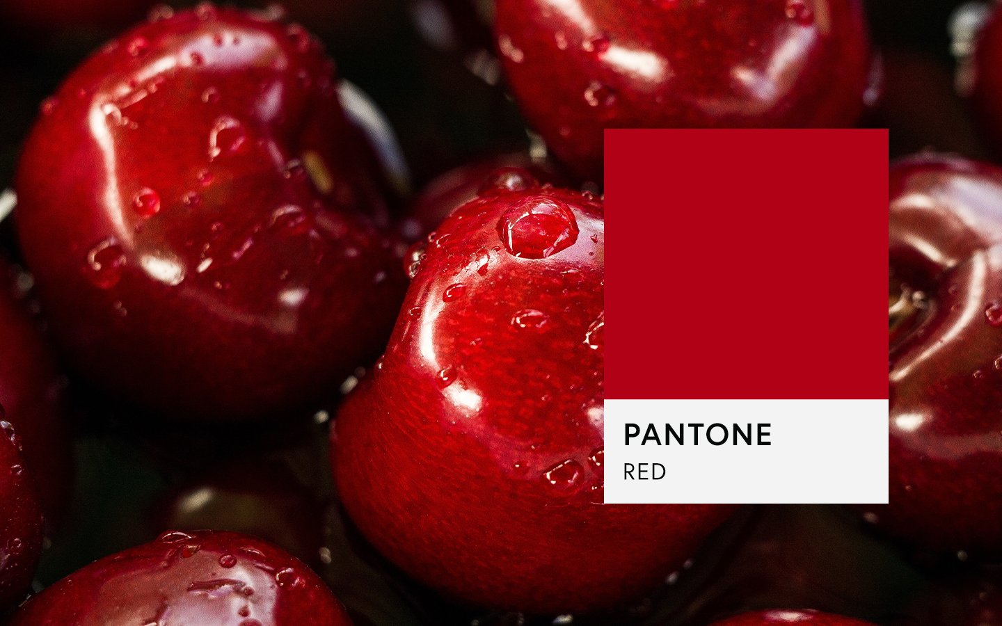
RED
In the world of design, colour plays a crucial role in establishing brand identity and leaving a lasting impression on consumers. As a business owners looking to build a modern and memorable branding, understanding the psychology behind colours is paramount. In this blog post, we will delve into the captivating world of red and its profound impact on brand identity, exploring why it is widely used by renowned companies such as Coca-Cola, Christian Louboutin, and Jo Loves.
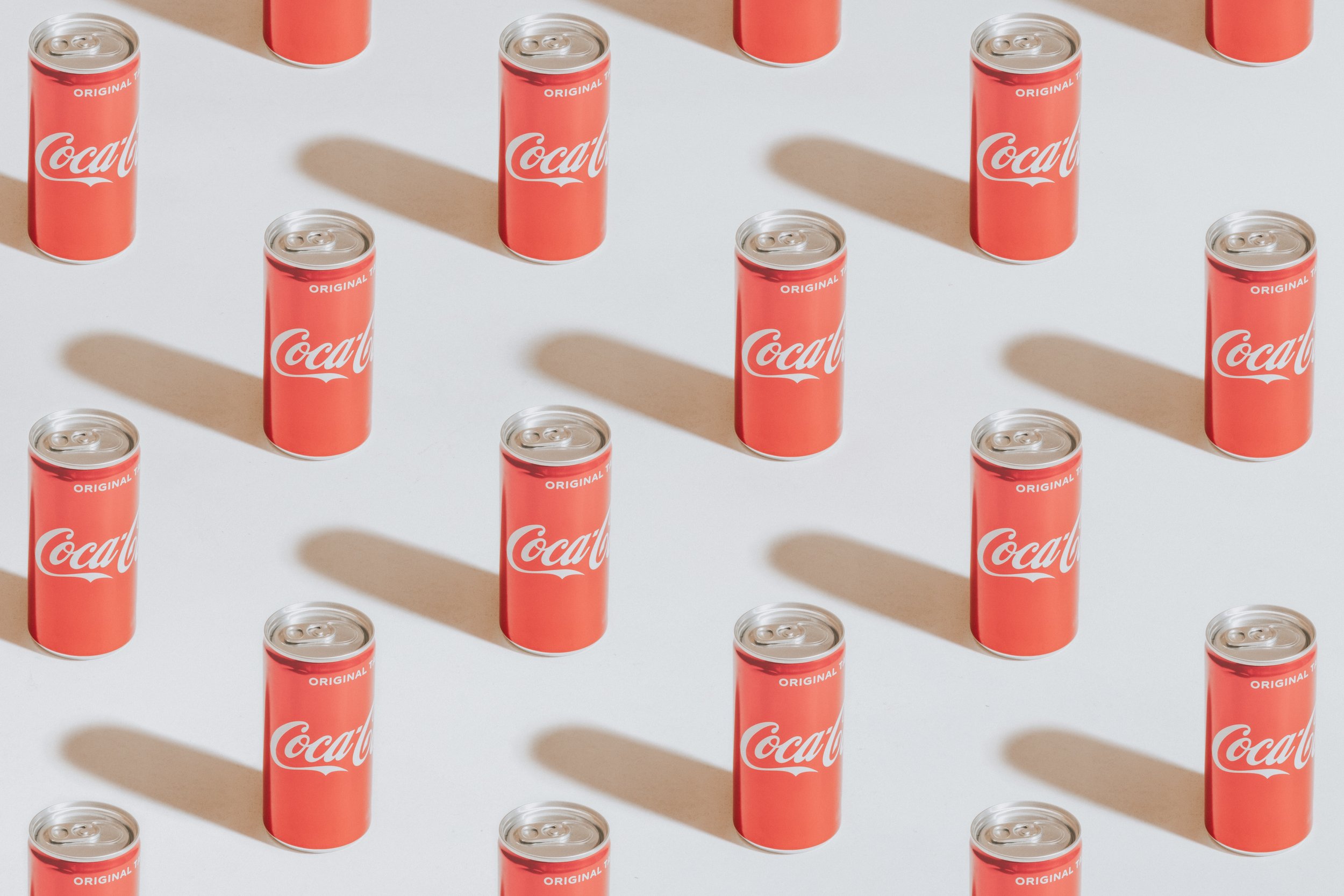
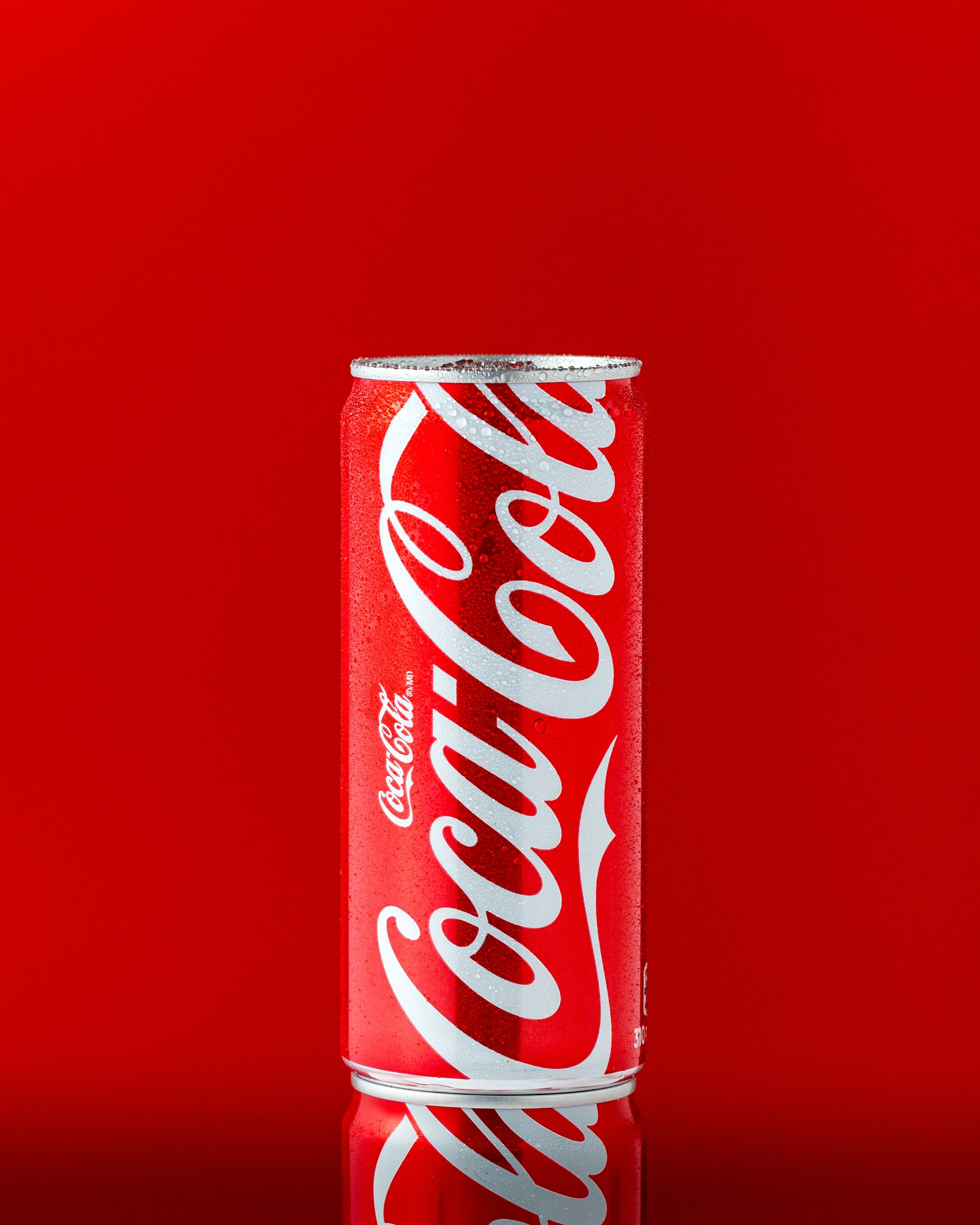
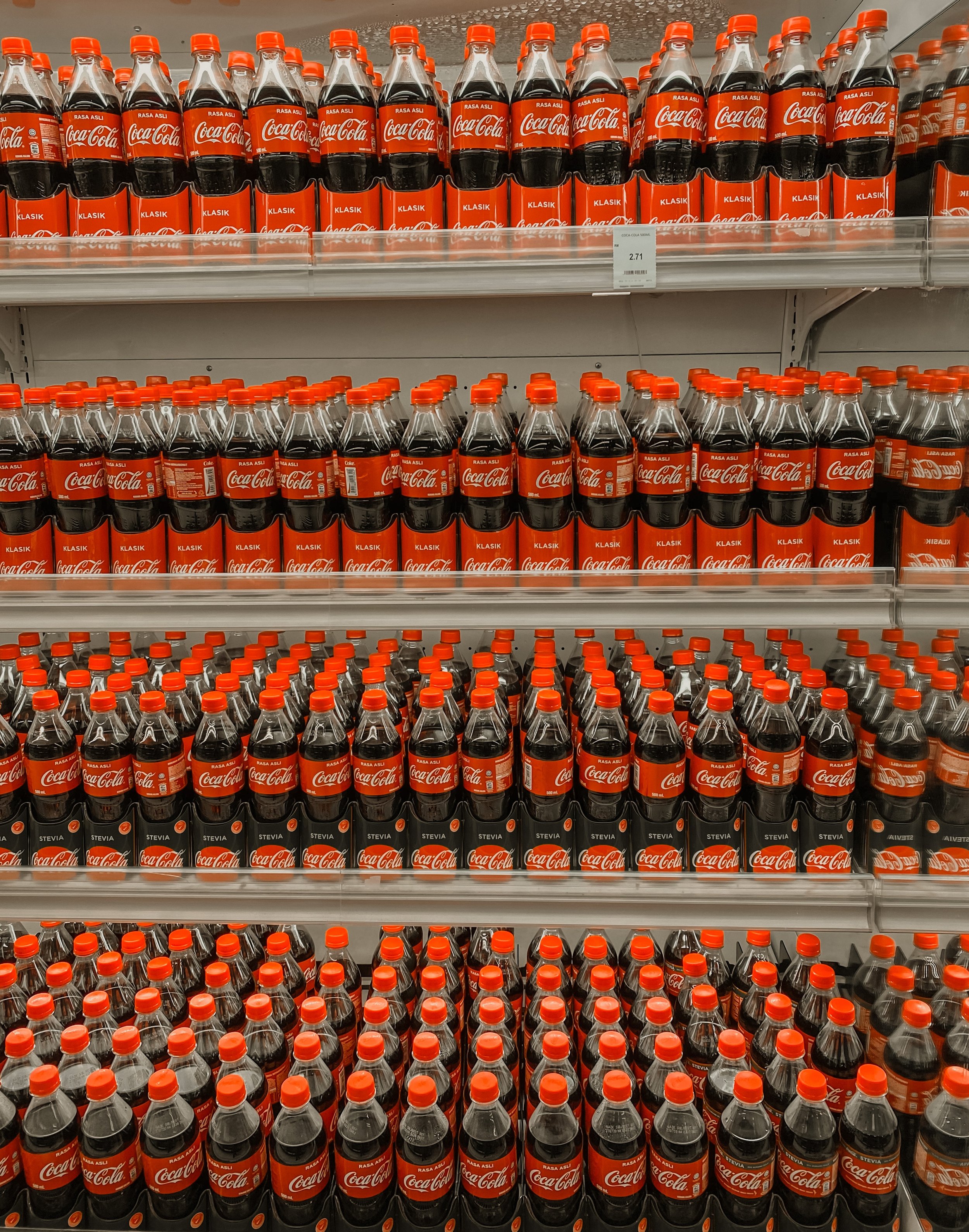
Red, often associated with passion, energy, and excitement, is a vibrant hue that exudes power. It is no wonder that numerous brands choose red as a cornerstone of their visual identity. One such iconic brand is Coca-Cola. The globally recognised beverage company has successfully utilised red as its primary brand colour for decades. In fact, when we think of red and ‘brand’ it’s ofter the first name off of our lips. The vibrant red hue of their logo and packaging evokes a sense of energy and joy, effectively capturing the attention of consumers. It really stands out on the shelf, vending machine or fridge in comparison to its competitors. By associating themselves with red, Coca-Cola has fostered a strong emotional connection with their audience, making their brand instantly recognisable and memorable.
The true power of brand colour is exemplified by the story of Father Christmas's suit. Historically, Father Christmas was depicted wearing a green suit. However, when Coca-Cola began using red as a central part of their branding, they reimagined Father Christmas to align with their brand identity in their advertising - ‘holiday’s are comin’…holiday’s are comin’! By dressing him in red, Coca-Cola solidified the association of this colour with joy, celebration, and the holiday season which resonated so widely, this is now how the western world know Santa. This transformation is a testament to the immense impact colour can have on our perceptions and cultural symbolism.


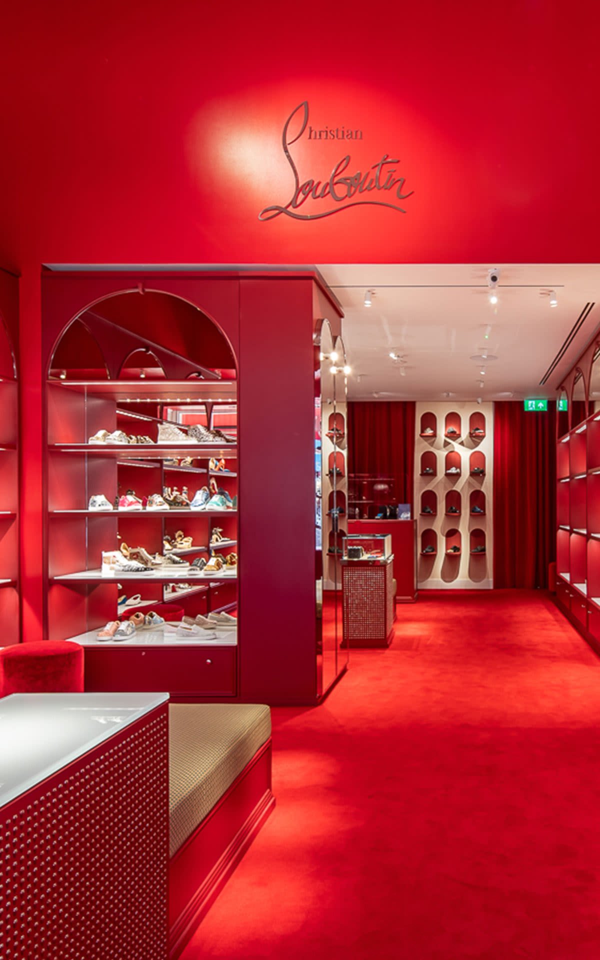
Another brand that harnesses the power of red is Christian Louboutin, the renowned luxury footwear designer. Christian Louboutin's signature red soles have become synonymous with sophistication and elegance. The designer's decision to use red soles on his shoes was inspired by a stroke of creativity and a nod to femininity. Inspired by an incident that occurred while designing, Louboutin noticed that a prototype wasn't captivating enough. He saw his assistant painting her nails with red nail polish and spontaneously grabbed the bottle and applied it to the soles of the shoes. The red instantly transformed the design, and thus the iconic red sole was born.
This bold and distinctive choice has not only set his brand apart but has also become an instantly recognisable symbol of luxury and high fashion. The red soles create a sense of exclusivity and desire, adding an element of prestige to each pair of shoes. So much so that Louboutin took legal action to protect the red sole as a trademark. In 2008, the brand secured a trademark protection in certain jurisdictions, allowing them to protect their exclusive use of the red sole on footwear, specifically when the sole colour contrasts with the rest of the shoe.


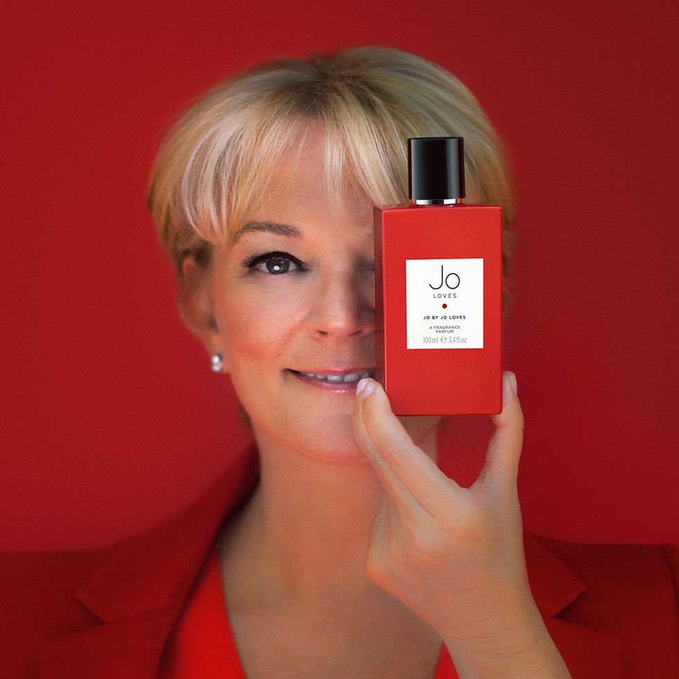
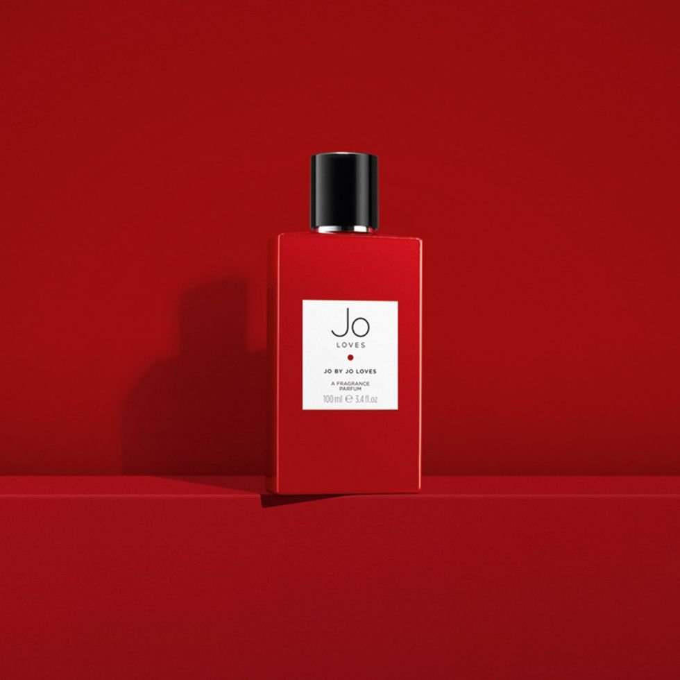
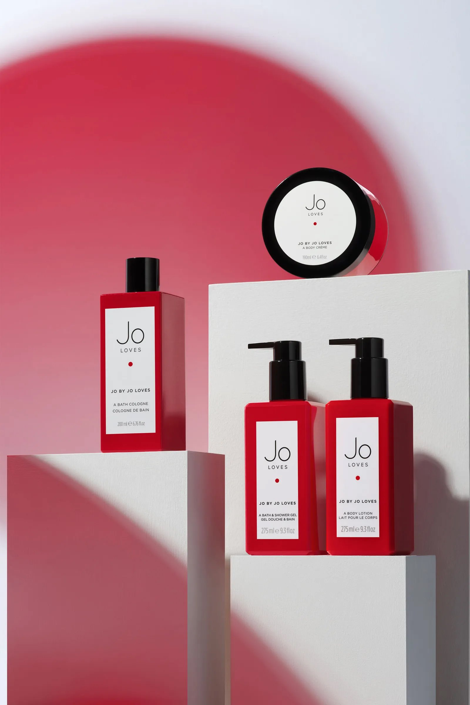
Jo Loves, the fragrance and skincare brand founded by Jo Malone, is another notable example of the strategic use of red in brand identity. Jo Loves incorporates a rich shade of red in its branding, packaging, and visual materials. The choice of red aligns with the brand's passion for creating bold and impactful fragrances that evoke emotions and memories as well as the obvious use of ‘Loves’ in the brand name being linked synonymously with the colour red.

Service-based businesses, in particular, can benefit greatly from incorporating red into their brand identity. Red signifies action, urgency, and vitality, making it an ideal colour choice for businesses that want to portray confidence and assertiveness. For example, red can be effective for consultancy firms, advertising agencies, or event management companies, as it conveys a sense of dynamism and demonstrates the ability to deliver results promptly.
When it comes to brand identity and design, the psychology of colour cannot be underestimated. Red, with its ability to evoke passion, energy, and urgency, is a powerful tool for businesses seeking to establish a strong and memorable brand presence. By working with a design agency or a freelance graphic designer who understands the nuances of colour psychology, you can unlock the potential of red and create a brand identity that resonates deeply with your target audience. Embrace the power of red and watch your brand flourish. Get in touch for branding packages today.