The Power of colour - BLUE
Welcome back to our series, The Power of Colour. This year we’ve been exploring and share the powerful impact that colour can have on our emotions, behaviour and overall well-being. In the last post we explored the psychological impact of green This month, we discover the power of blue in modern branding for service and product based businesses.

Need help with design work in 2023?
BLUE
In the world of branding, colour plays a crucial role in creating a brand identity that resonates with your target audience. The right colour can communicate your brand's values, personality, and essence, and make a lasting impression on your customers.
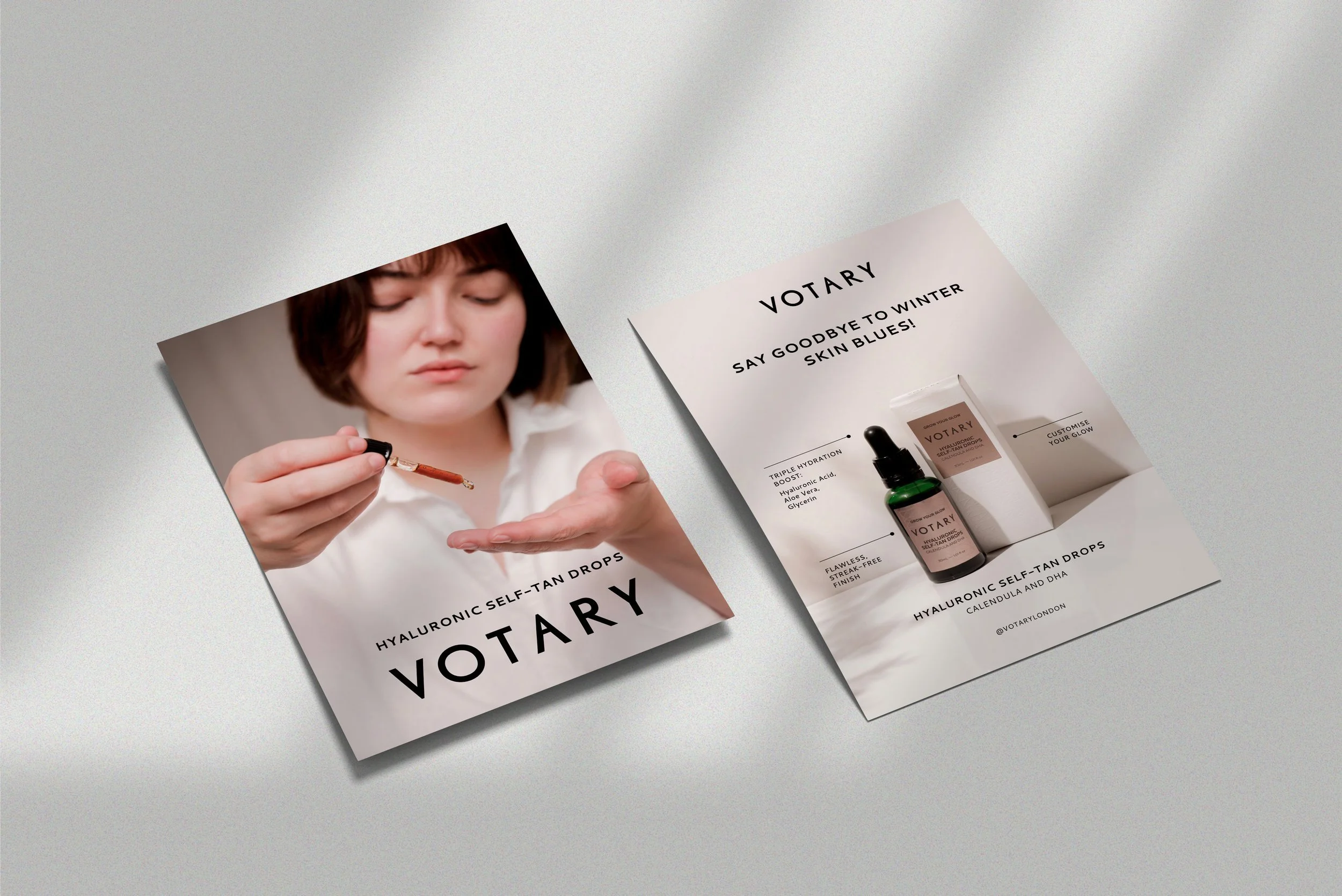
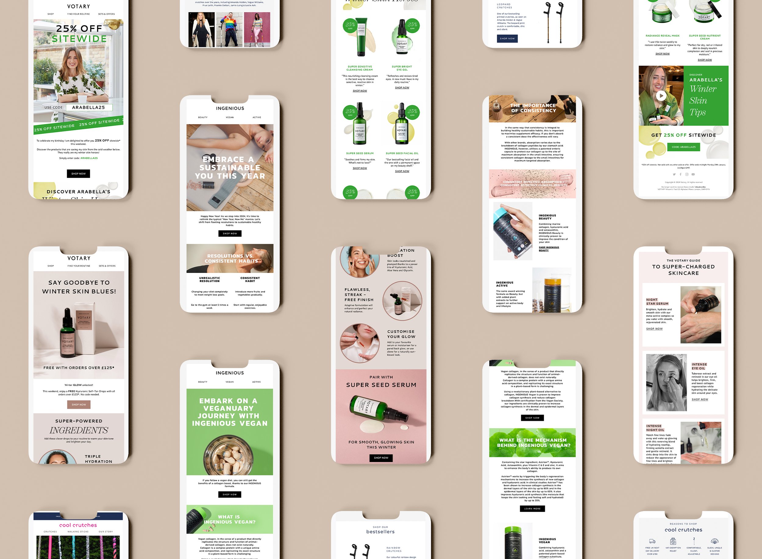
As freelance graphic designers and branding experts, we’ve know the importance of creating a strong brand identity that resonates with your target audience. One of the key elements of any brand identity is the colour palette, and there is no colour more powerful (or popular) than blue.
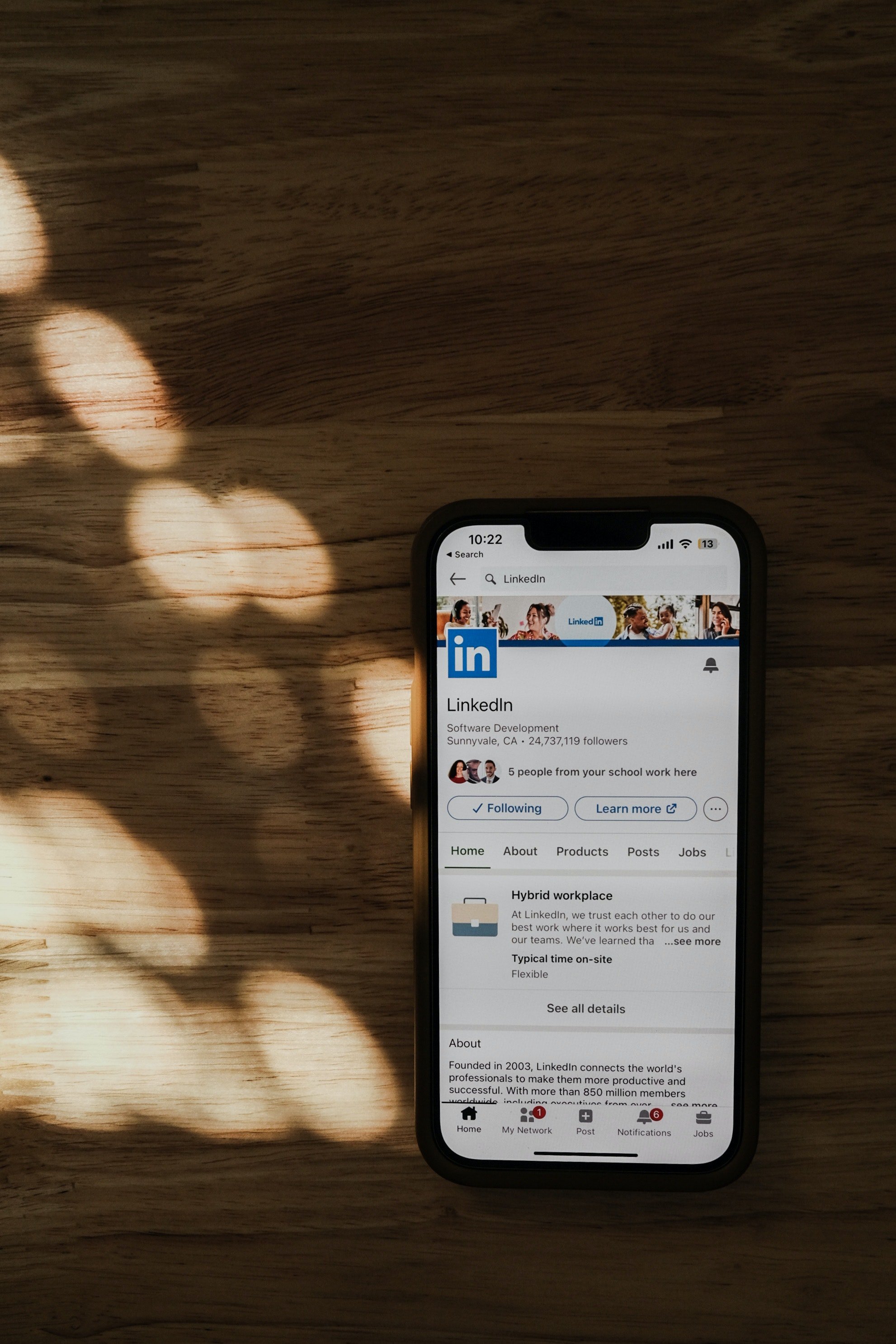
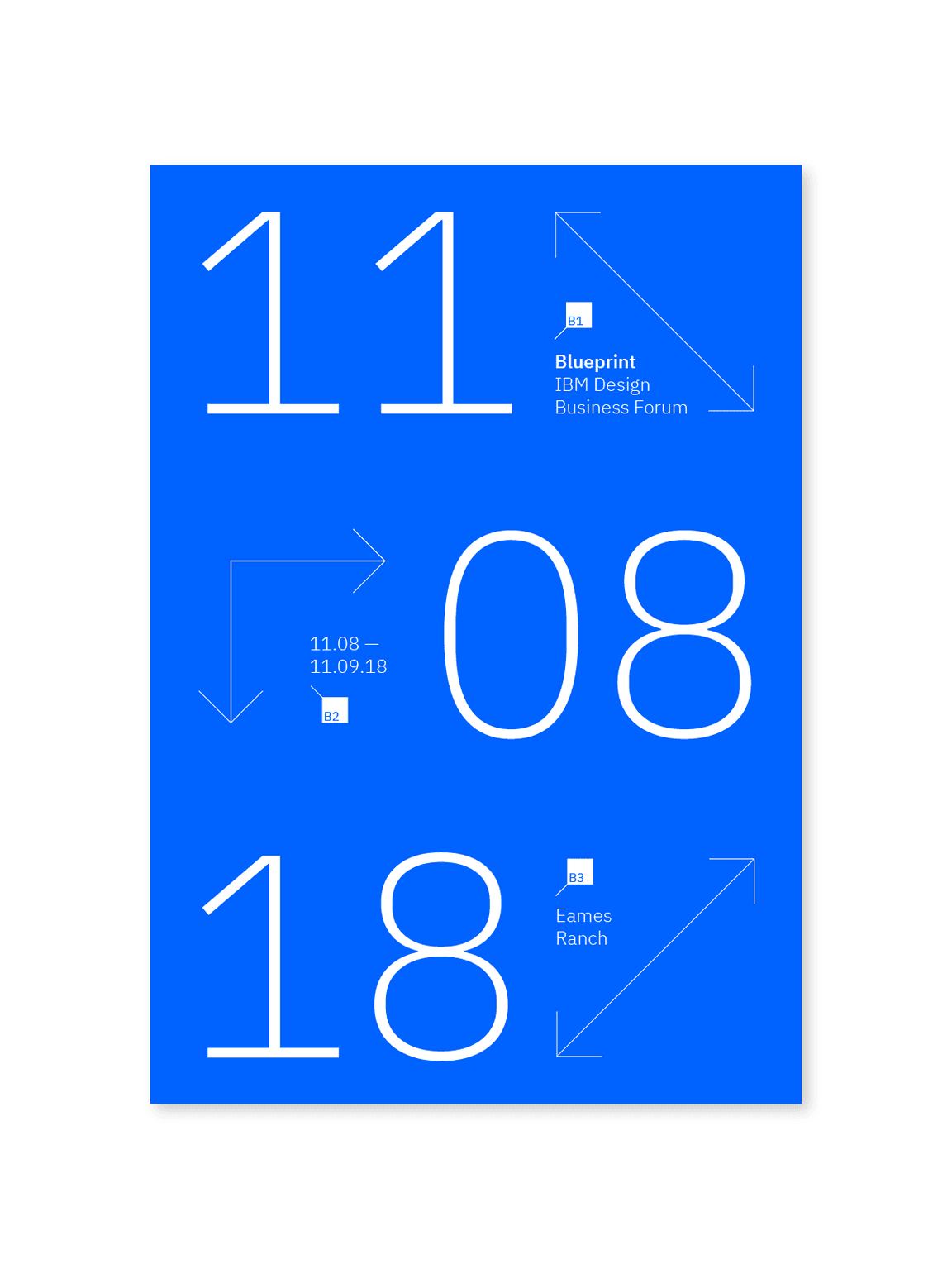
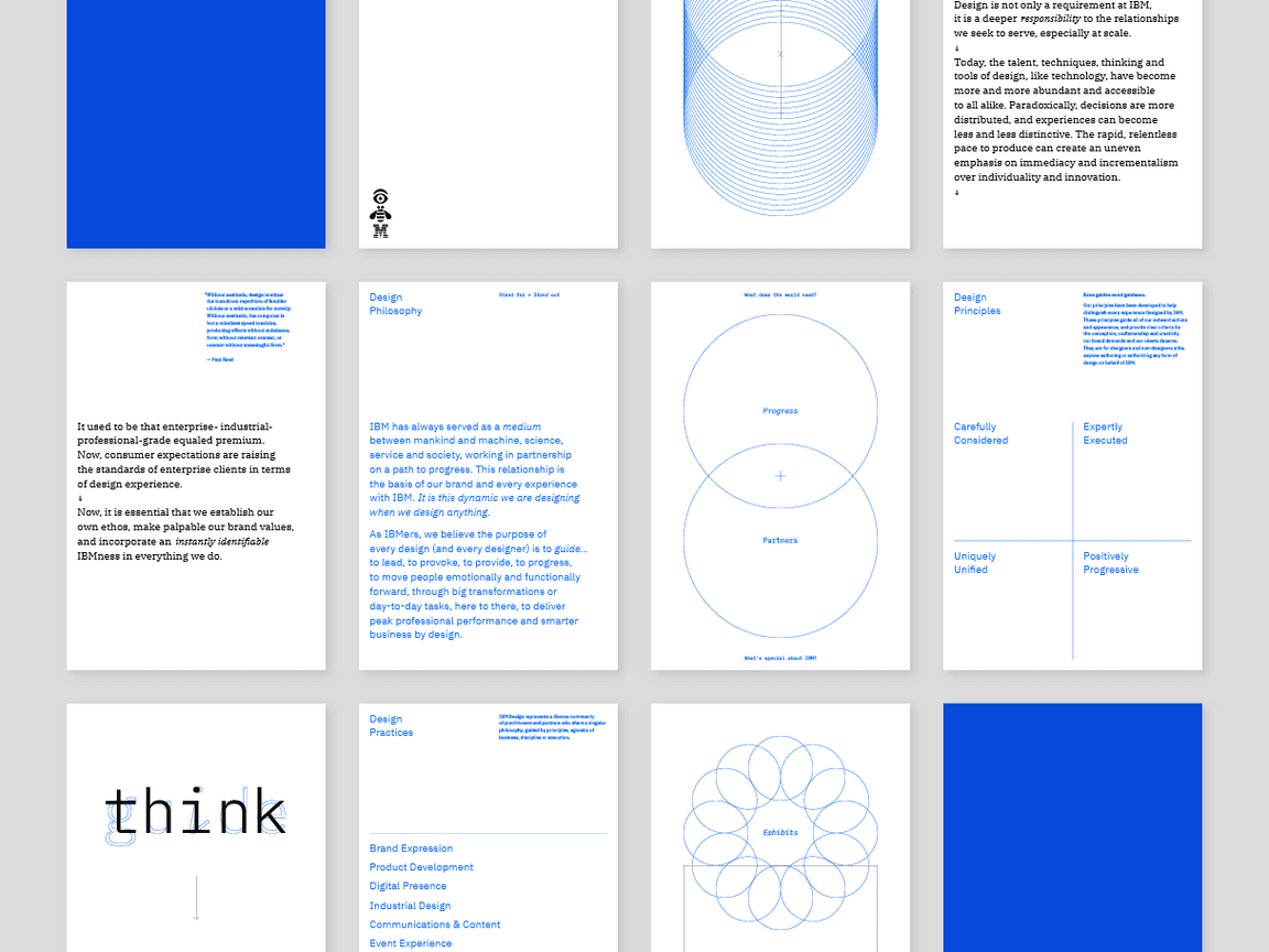
Blue has many tones, from navy to aqua and so is a timeless colour that can be used to convey a wide range of emotions and qualities, from trust and reliability to calmness and professionalism. In fact, many of the world's leading service-based businesses, such as LinkedIn and IBM have chosen blue as their primary brand colour for these very reasons.

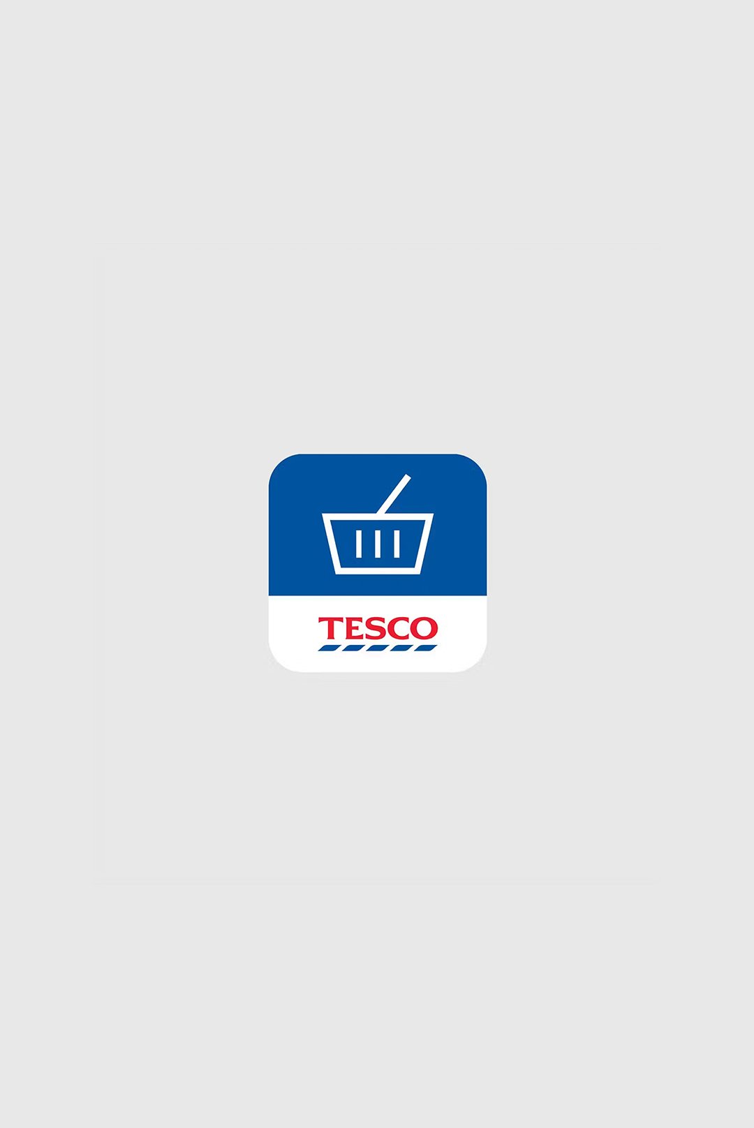
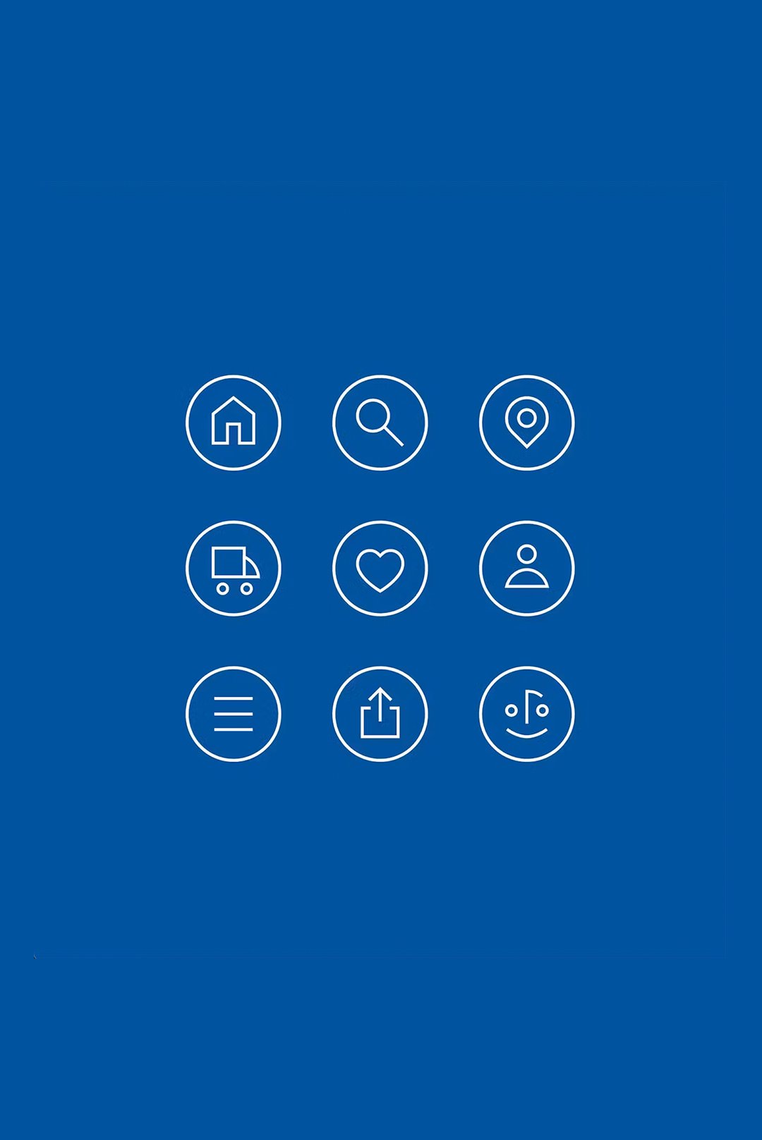
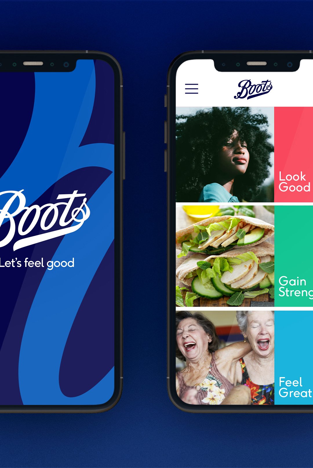
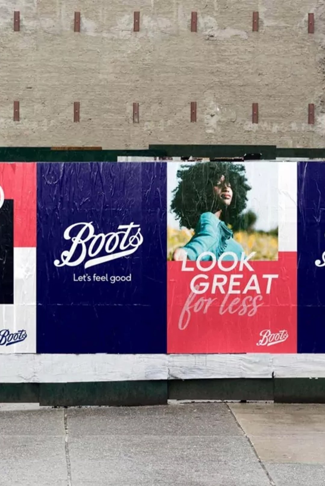
It is a reassuring colour, which pair with the connotations of reliability, is why high-street brands Tesco and Boots have used the colour for many years.
When it comes to colour psychology, blue is often associated with qualities such as trust, security, and stability. This makes it an ideal choice for businesses that want to convey a sense of dependability to their customers. It is also a calming colour that can help to reduce stress and anxiety, which is especially important in industries such as healthcare and finance.
One of the reasons why blue is so effective for service-based businesses is that it is a colour that people tend to associate with professionalism and competence. When someone sees a brand that uses blue, they are more likely to perceive it as being trustworthy and capable. This can be particularly important in industries such as law, consulting, and accounting, where clients need to have confidence in the expertise of their service providers.
Another advantage of using blue in your brand identity is that it is a highly versatile colour that can be used in a variety of different shades and tones. From light and airy pastels to deep, rich navy blues, there is a shade of blue that will work for almost any brand. This versatility makes it a popular choice for businesses that want to create a modern and sophisticated brand identity.
Of course, not every business is the same, and there may be instances where blue is not the best choice for your brand identity. However, as a design agency, we have seen firsthand how effective blue can be in creating a strong and memorable brand identity.
If you are looking to create a professional brand identity for your business, then consider blue. Its association with trust, reliability, and professionalism, combined with its versatility and wide range of shades, make it an ideal choice for any business that wants to create a strong and lasting impression on their customers.